
course logo & packaging
category hospitality, branding
completion 2021
typography fieldwork, embury
deliverables stationery, toiletries, take-aways, logo
category hospitality, branding
completion 2021
typography fieldwork, embury
deliverables stationery, toiletries, take-aways, logo
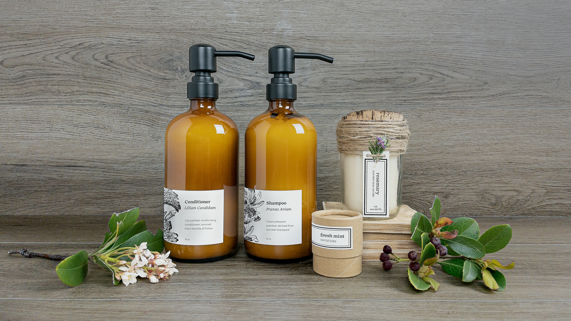
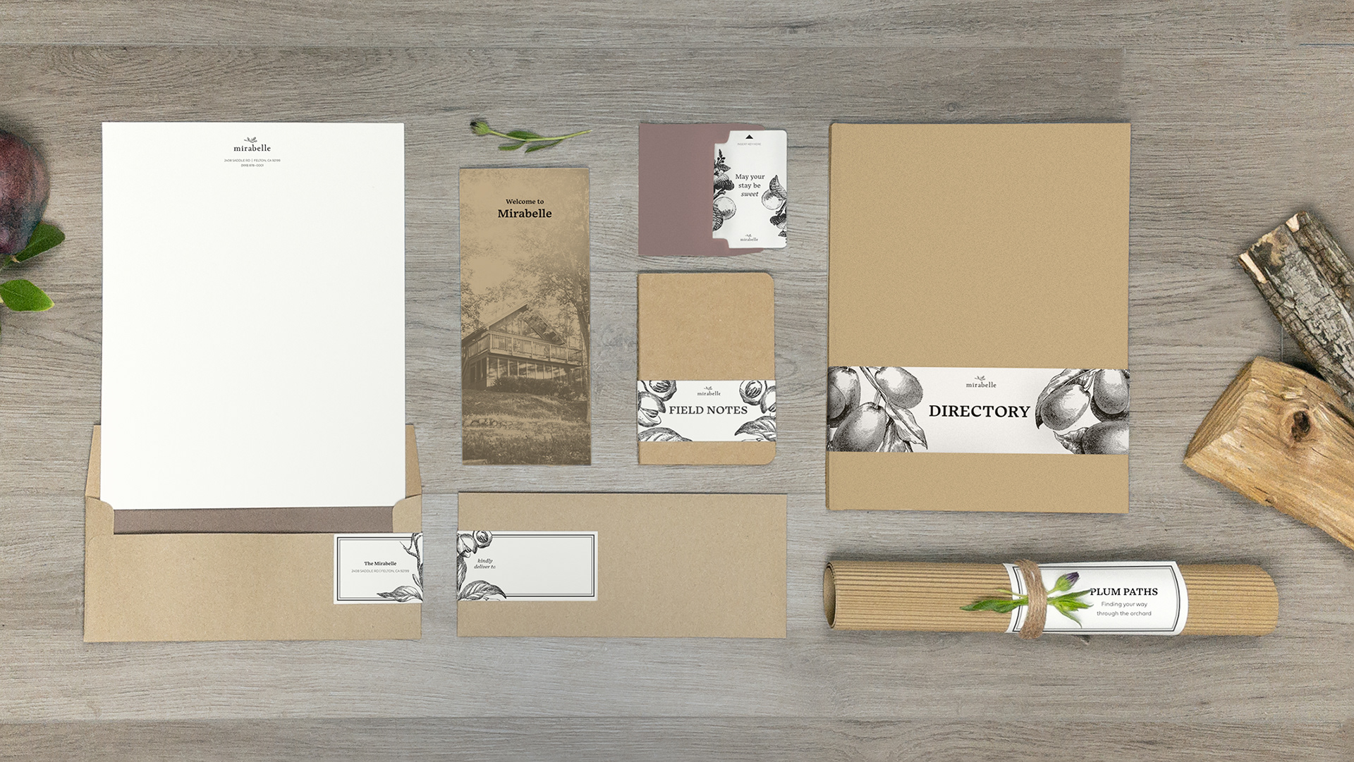
objective
Mirabelle is a conceptual design for a cabin-style hotel nestled in Felton, California. This hospitality establishment caters to seniors and retirees, aiming to foster a sense of trust through a brand identity that balances rustic charm with modern cleanliness. My role involved crafting a cohesive visual language encompassing the logo, graphic elements, and tone of voice applied across various guest touchpoints, including stationery, toiletries, and takeaways.
solution
To capture the essence of Felton's natural beauty while prioritizing legibility, the Embury typeface was selected for use on labels, signage, and brand messaging. This choice conveys a sense of approachability and warmth, aligning perfectly with the welcoming and trustworthy atmosphere Mirabelle strives to create. Fieldwork typeface complements Embury for smaller text applications thanks to its high x-height and low contrast. Its user-friendly design fosters a sense of comfortable familiarity, reflecting Mirabelle's commitment to guest well-being.