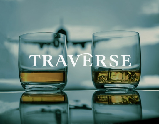

course logo & packaging
category packaging, canned cocktail, vintage ephemera
completion 2020
typography madegra, avenir next, arpona
deliverables beverage art & typesetting, social media
category packaging, canned cocktail, vintage ephemera
completion 2020
typography madegra, avenir next, arpona
deliverables beverage art & typesetting, social media
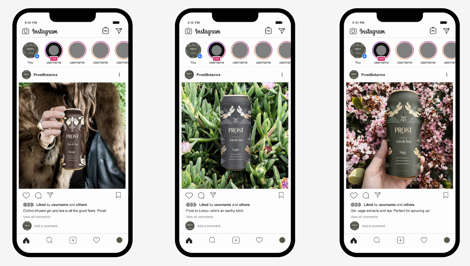
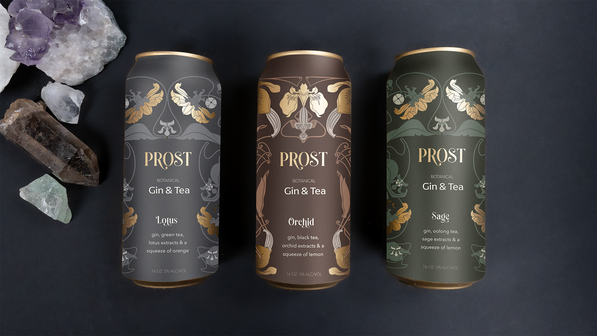
objective
The popularity of canned beverages continues to rise, yet a sophisticated hard tea with packaging that reflects its discerning target demographic remains elusive. This project aims to address this gap by introducing Prost, a botanical-infused gin and tea beverage with an air of mystique. Recognizing that the gin market primarily skews female, while canned cocktails resonate with millennials, Prost is uniquely positioned to capture the essence of both.
solution
Targeting a specific segment of millennial women with a penchant for botanical aesthetics, Prost's visual identity draws inspiration from the Art Nouveau era, employing a color palette reminiscent of the Vienna Secession movement. This evocative ornamentation, akin to vintage bohemian jewelry, creates a sense of connection between the brand and its audience, inviting them to "wear" and consume Prost simultaneously. To complement the design, Madegra typeface is chosen for its expressive qualities, while Avenir provides a clean and readable counterpoint for secondary typography.