
course page layout
category menu design
completion 2021
typography baskerville; disturbance, mr eaves mod
category menu design
completion 2021
typography baskerville; disturbance, mr eaves mod
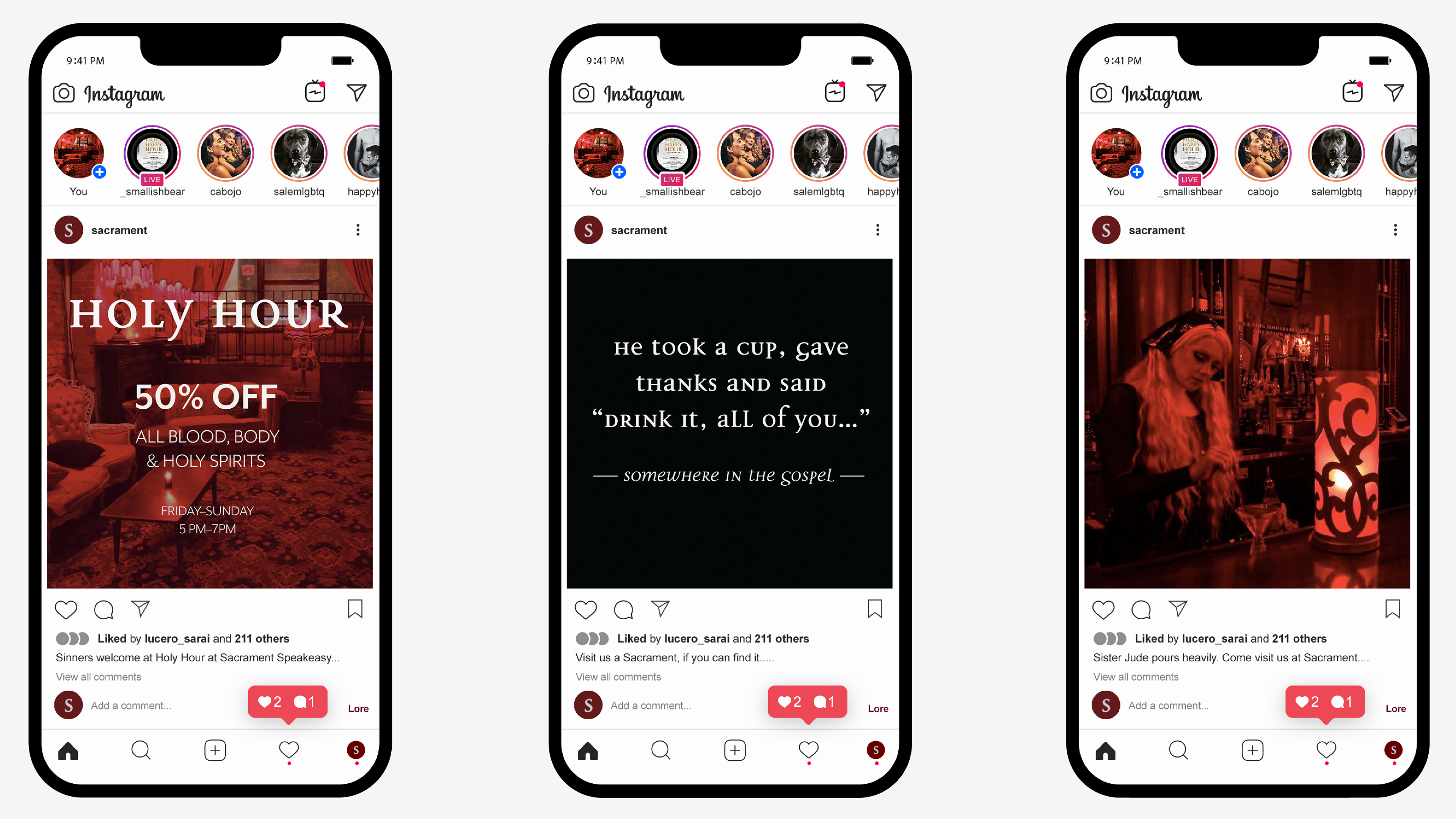
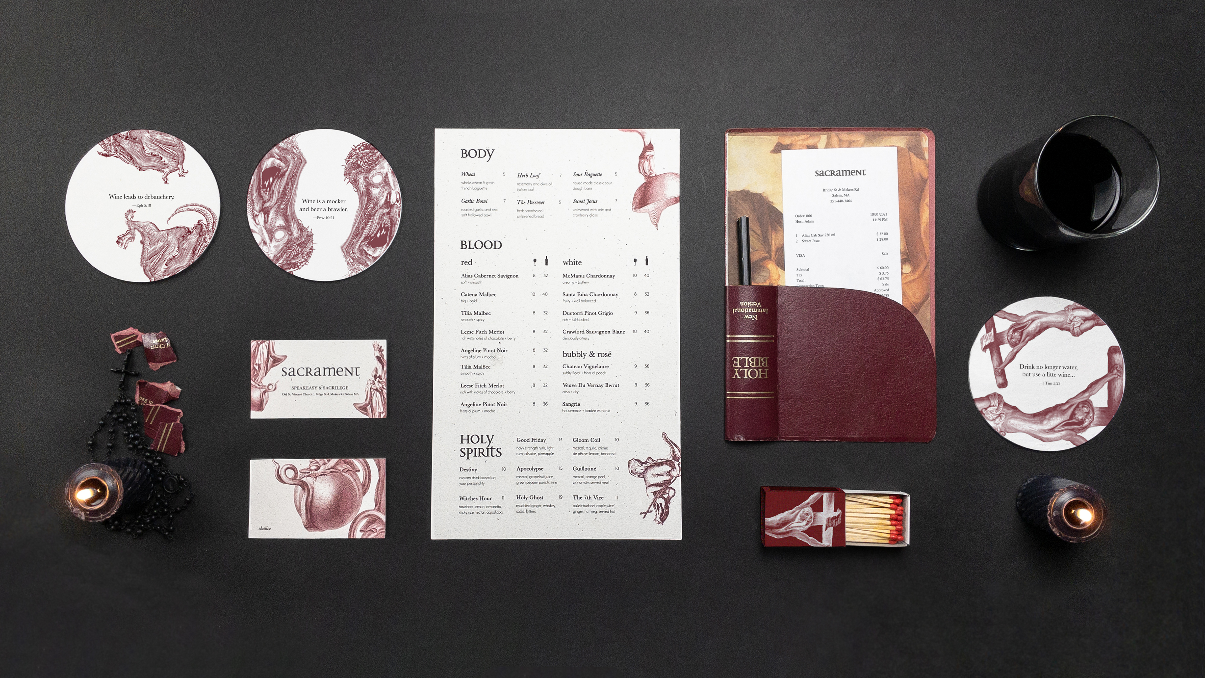
objective
Sacrament offers a unique nightlife experience for the LGBTQ+ demographic aged 25-40, specifically catering to those who seek a subversive alternative to mainstream club culture. Hypothetically housed within a repurposed Carpenter Gothic church, the venue embraces a playfully sacrilegious theme, subtly challenging societal norms through its very existence. This theme is further emphasized through Sacrament's menu and branded items, which utilize eco-friendly and repurposed materials, reflecting a commitment to sustainability while maintaining a distinct aesthetic. My design objective is to capture this essence of playful defiance through a visually striking Victorian-inspired typography system.
solution
Sacrament's color palette, graphic elements, and branded items prioritize a balance between rich ornamentation and sustainable practices, minimizing waste and resource consumption. Locally sourced hemp paper is utilized for both menus and business cards, while repurposed bibles add a touch of thematic intrigue for check presentation. The incorporation of warped vintage etchings in bold crimson hues injects a hauntingly dramatic flair, while a clean and uncluttered typographic layout ensures the menu remains legible even for patrons with less than optimal focus.