
course page layout
category niche magazine, layout
completion 2021
typography haboro, scotch, owners
deliverables logo, custom lettering, grid system, ephemera
category niche magazine, layout
completion 2021
typography haboro, scotch, owners
deliverables logo, custom lettering, grid system, ephemera
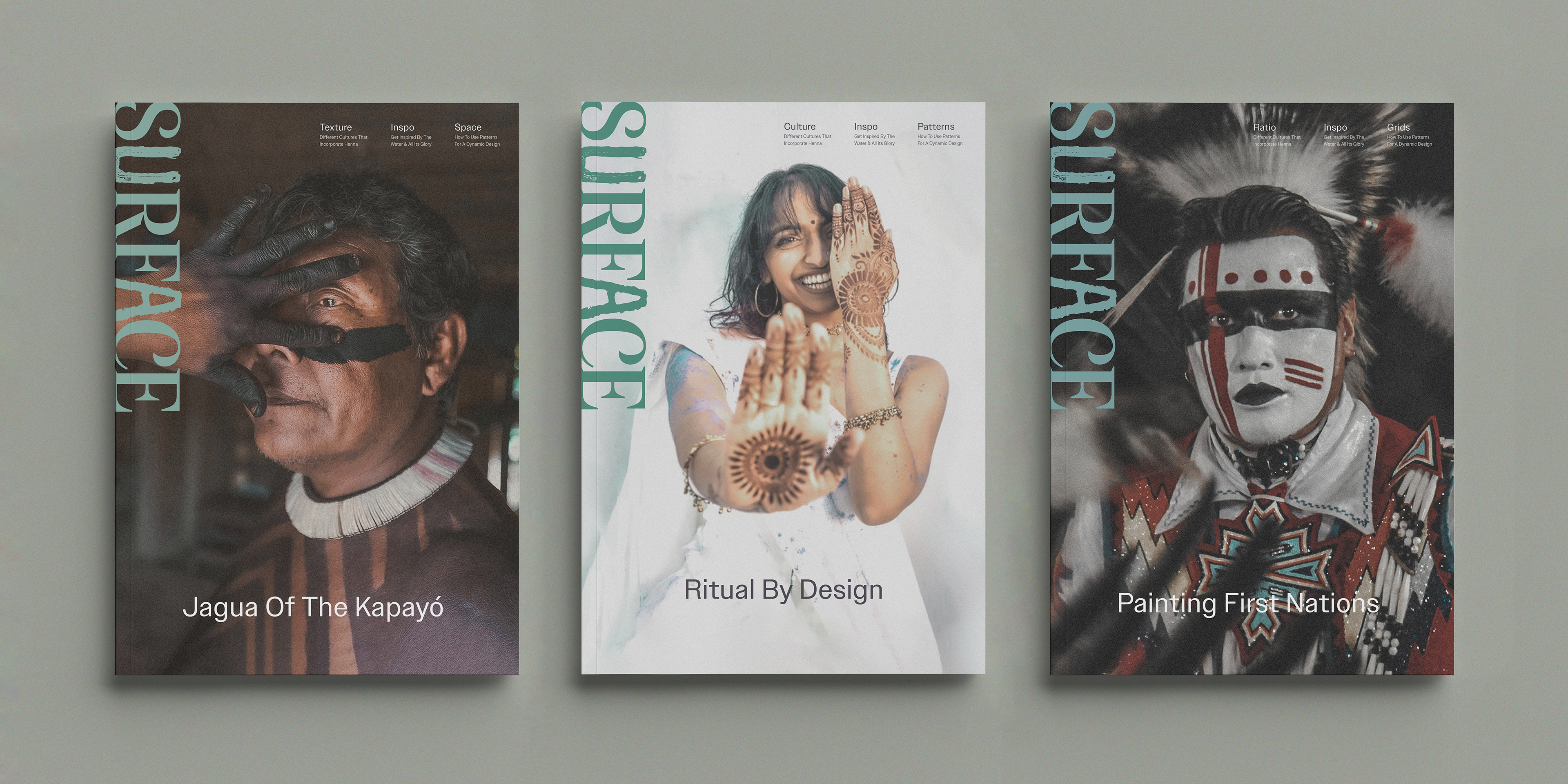
objective
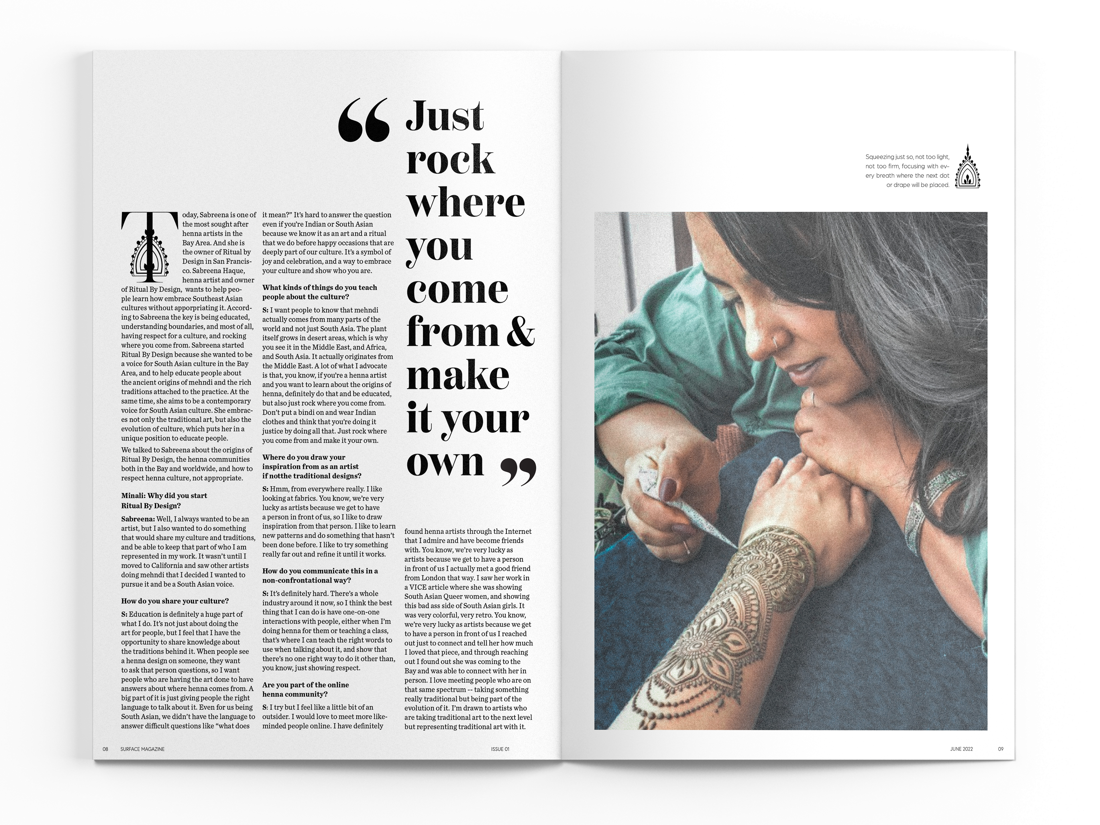
Surface Magazine delves into the multifaceted world of temporary body art across various cultures. Geared towards women artists aged 25-40 who are likely already engaged with or knowledgeable about this subject, the magazine aims to celebrate and explore the rich history and cultural significance of these practices. To achieve this, the design prioritizes a respectful and minimalist approach, leveraging negative space to elevate the subject matter.
solution
To further reinforce the magazine's connection to nature, a custom logo was created using hand-painted letterforms, evoking an organic and personal touch. This is then paired with the versatile and elegant Haboro typeface for a balanced visual effect. The layout utilizes two and three-column grids, creating generous negative space that is playfully disrupted by carefully placed graphics and impactful pull quotes. This interplay of negative space and elements mirrors the dynamism and textural richness inherent in body art itself. The warm and slightly grainy photo editing style adds a touch of bohemian flair and underscores the enduring legacy of body ornamentation throughout history.