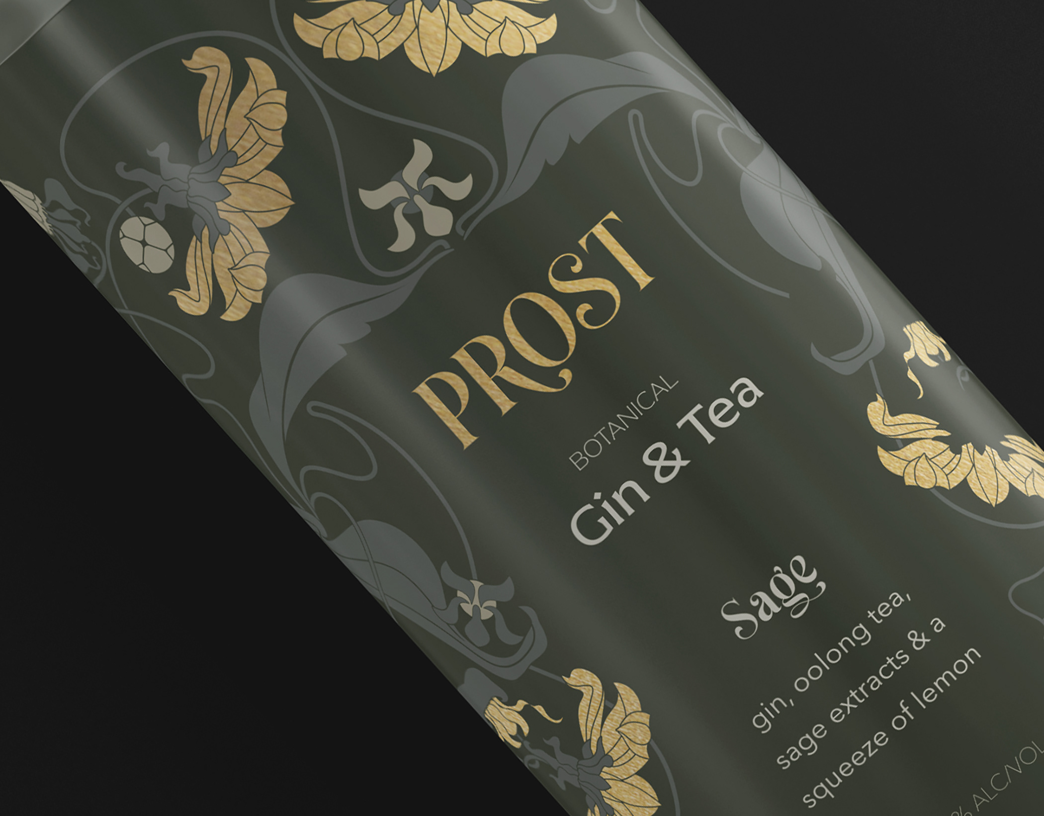

course advanced typography
category spirits, packaging, typography
completion 2020
typography aria, freight, pilat
deliverables typographic label, social media, logo
category spirits, packaging, typography
completion 2020
typography aria, freight, pilat
deliverables typographic label, social media, logo
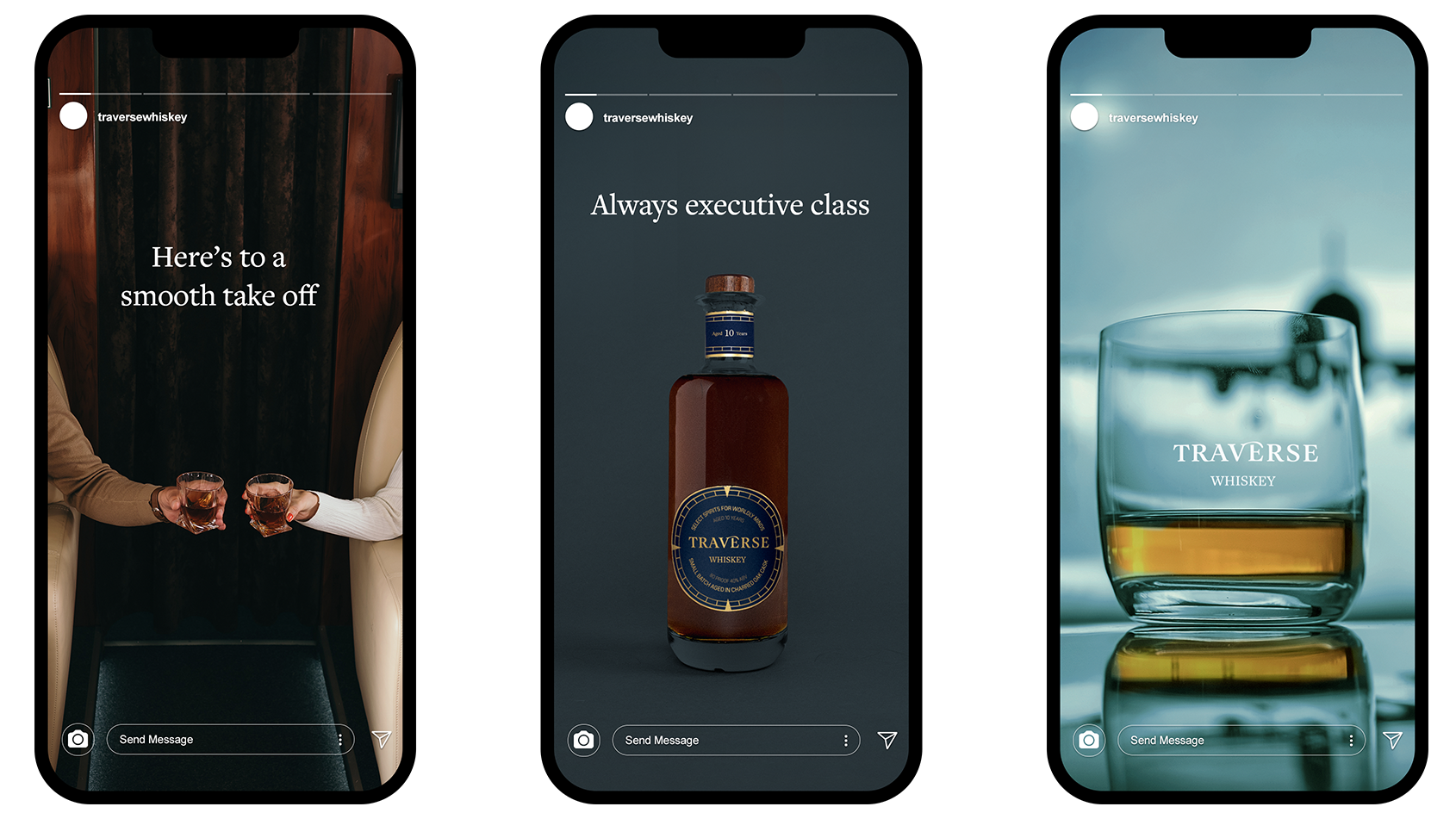
objective
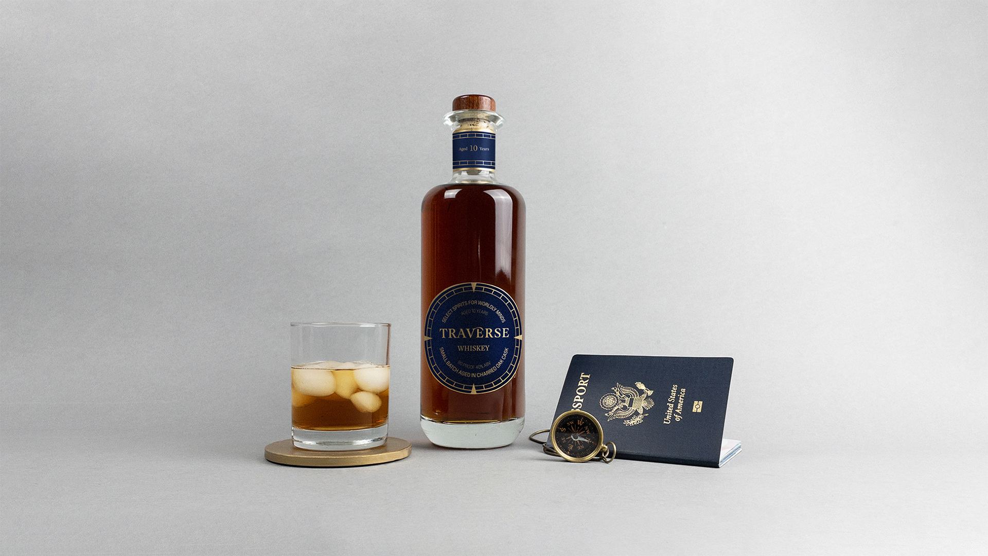
This project presents the conceptualization of "Traverse," a travel-exclusive whiskey brand targeting discerning travelers. Traverse caters to a mid-to-high-income demographic who frequently travel for business and leverage a specific airline. The brand voice embodies a charmingly sophisticated persona, reminiscent of James T. Kirk from Star Trek. It strikes a balance, acknowledging the seriousness of business endeavors while acknowledging the personal lives of its clientele. The design challenge here was to create a typographic label utilizing minimal decorative elements
solution
The whiskey logo adopts a classic aesthetic, crafted in the Aria typeface. This selection was made for its high-end feel, with transitional serifs that offer a touch of liberation and a moderate level of contrast for legibility. A custom swash adorns the apex of the "V," adding a subtle sense of dynamism. To further emphasize the brand's travel focus, a subtle compass rose motif appears on the label's edge, creating a counterpoint to the sleek lines of the Nordic-inspired bottle. The color palette utilizes a marine blue, chosen for its evocation of trust, authority, and a sophisticated jet-setting lifestyle.