course logo & packaging
category branding
completion 2021
typography industry, ff good pro
deliverables logo, brand guide, brand audit, instagram template
category branding
completion 2021
typography industry, ff good pro
deliverables logo, brand guide, brand audit, instagram template
objective
Play It Again Sports, a locally owned franchise specializing in the resale of athletic equipment, faces challenges in maintaining brand cohesion across various touchpoints. These include an outdated logo (circa 1990s), inconsistent in-store signage, and a dormant social media presence. The time constraints of the busy ownership team limit their ability to focus on marketing and branding initiatives. My objective was to develop a practical and unified brand identity for Play It Again Sports
solution
The existing orange and pink color palette is maintained to ensure brand recognition. A new logo is designed utilizing the Industry typeface in all lowercase for a balance of authority and approachability. Good Pro is selected as the secondary typeface due to its versatility and legibility across various signage applications. To achieve brand consistency, a comprehensive brand guidelines document will be created, along with a user-friendly online printing portal and customizable social media templates. This system would streamline franchise implementation, allowing users to easily update marketing materials through a click-and-type or drag-and-drop interface.
brand health check
franchise consistency
Constructed with custom branded letter size paper and a simple type setting ensures cohesive signage, which can be quickly typed up and produced with any printer.
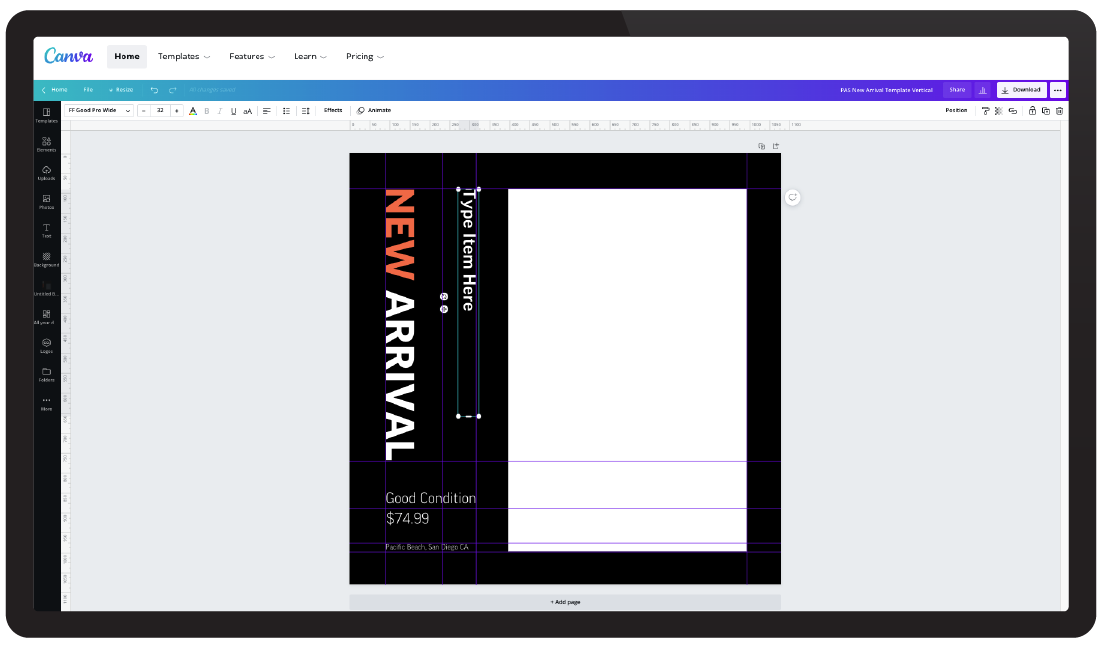
social media templates
These custom Instagram templates include predetermined type boxes and image frames for dragging in photos. Using Canva's background editor for new arrivals and adjusting local athletes photo saturation ensures clean and consistent social media posts.
